Exploring the Grammar of Data Visualization for an Enhanced Customer Experience | Part1
In the digital age, data is king, and the ability to present it effectively is the throne. As a content marketer, your mission is to harness the power of data visualization to enhance the customer experience. In this comprehensive guide series, we'll delve deep into the art and science of data visualization, equipping you with the knowledge and tools to create compelling and impactful visualizations. So, let's embark on a journey through the grammar of data visualization.
What is Data Visualization?
Data visualization is the art of transforming complex data into visual representations that are easy to understand. It's like turning raw numbers into a story that anyone can follow. Instead of drowning in spreadsheets and databases, data visualization allows us to see patterns, trends, and insights at a glance. It's a universal language that bridges the gap between data and human comprehension.
In essence, data visualization takes information and transforms it into charts, graphs, and other visual formats. These visuals can range from simple bar charts to intricate 3D renderings, depending on the data and the story you want to tell. The key is to present data in a way that makes it not only digestible but also engaging.
Importance of Effective Data Visualization
Effective data visualization isn't just a fancy way to present information; it's a critical tool for decision-making and communication in today's data-driven world. Here's why it matters:
Clarity and Understanding
Imagine you're presented with a spreadsheet of sales data for the past year. Rows and columns of numbers can be overwhelming. But when that same data is visualized as a line graph showing sales trends, suddenly, patterns emerge. You can see when sales peaked, when they dipped, and what factors influenced these changes. Data visualization brings clarity and understanding to otherwise complex information.
Rapid Decision-Making
In business, time is money. Effective data visualization accelerates decision-making by presenting information in a format that's easy to grasp. Instead of poring over pages of reports, executives can quickly interpret visuals to make informed choices.
Uncovering Insights
Data visualization helps uncover hidden insights. By representing data visually, you can spot trends, outliers, and correlations that might have gone unnoticed in a sea of numbers. These insights can lead to innovative strategies and competitive advantages.
Engaging Stakeholders
Whether you're presenting to clients, stakeholders, or colleagues, visualizations are more engaging than data tables. They capture attention and enable you to tell a compelling story with your data.
Now that we've established the importance of data visualization, let's dive deeper into the fundamentals.
The Fundamentals of Data Visualization
Types of Data Visualizations
Data visualizations come in various forms, each suited to specific data types and purposes. Here are some fundamental types:
Bar Charts
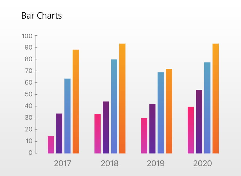
Bar charts are excellent for comparing categories or displaying data changes over time. They consist of rectangular bars, where the length or height of each bar represents a value. For example, you can use a bar chart to compare sales figures for different products.
Line Graphs
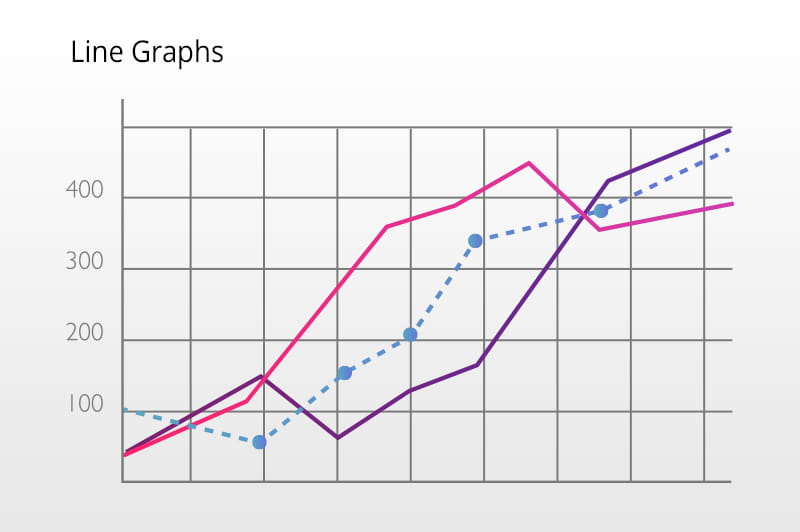
Line graphs are ideal for showing trends and continuous data. They use lines to connect data points, making it easy to visualize changes over time. For instance, you might use a line graph to track website traffic over a year.
Pie Charts
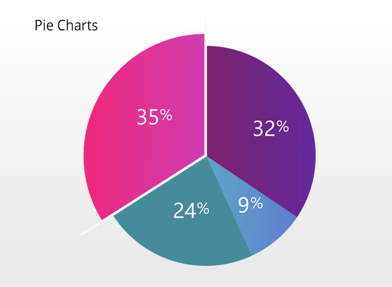
Pie charts represent parts of a whole. They're circular graphs divided into slices, with each slice representing a proportion of the whole. Pie charts are useful for illustrating percentages or showing the composition of a whole, like market share among competitors.
Scatter Plots
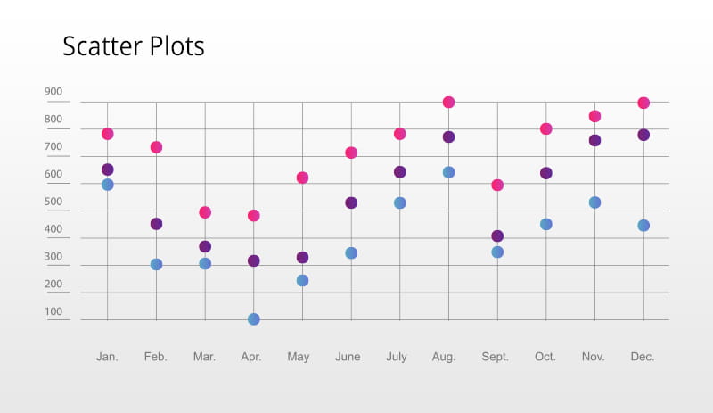
Scatter plots display individual data points on a two-dimensional grid. They're valuable for visualizing relationships between two variables. For example, you might use a scatter plot to explore the correlation between a product's price and its sales volume.
Principles of Effective Data Visualization
The Importance of Clarity
Simplify Your Message
Effective data visualization begins with a clear message. Before you create a chart or graph, ask yourself, "What do I want my audience to take away from this?" Your visualization should communicate a single, straightforward message. Avoid cluttering it with extraneous data or details that distract from the main point.
Avoid Misleading Visuals
Visualizations should accurately represent the data. Avoid tricks like distorting scales, using 3D effects, or manipulating axes to mislead viewers. Your goal is to build trust with your audience, and misleading visuals can erode that trust.
Consistency in Design
Color Schemes and Fonts
Consistency in design is essential for creating polished visualizations. Choose a color palette and font style that aligns with your brand or the message you want to convey. Consistent use of color and font helps create a cohesive and professional look.
Use of Visual Elements
Visual elements such as labels, legends, and annotations play a crucial role in guiding viewers and enhancing comprehension. Labels provide context, legends explain symbols, and annotations highlight important data points. Use these elements strategically to make your visualizations more informative.
Stay Tuned
In the next part, we'll delve into the grammar of data visualization, exploring the syntax, structure, and rules for effective data presentation. Stay tuned for more insights into creating compelling visuals that enhance the customer experience.