Exploring the Grammar of Data Visualization for an Enhanced Customer Experience | Part2
In the previous chapter we understood that data visualization has become an indispensable tool in today's data-driven world. It allows us to transform complex information into accessible, understandable, and actionable insights. Now in this article, we will dig deep into the various components of data visualization, from themes to aesthetics, and everything in between. Our aim is not only to educate but also to help you master the art of creating data visualizations that captivate and inform your audience.
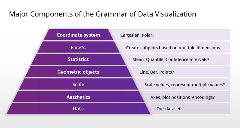
So, without any further delays, let’s have a walkthrough over the components of data visualization.
Components of Data Visualization
Themes in Data Visualization
Themes in data visualization serve as the foundation upon which the entire visualization is built. A theme sets the tone and provides consistency to your visual representation of data. Whether you're designing a chart, graph, or dashboard, selecting the right theme is crucial. Themes dictate color schemes, fonts, and overall styling, ensuring that your data visualization remains coherent and visually appealing.
Choosing the Perfect Theme
When choosing a theme, consider the nature of your data and your target audience. For instance, if you're creating a visualization for a financial report, a professional and conservative theme with muted colors might be suitable. On the other hand, if your audience is younger and more casual, a vibrant and engaging theme could be more effective. Always align your theme with your message and the emotions you wish to evoke in your audience.
Coordinates and Their Significance
Coordinates are the backbone of data visualization. They define how data points are positioned within a chart or graph, allowing viewers to interpret relationships and patterns. Two main types of coordinates are commonly used in data visualization: Cartesian coordinates (X and Y axes) and polar coordinates (circular or radial graphs).
Cartesian Coordinates
Cartesian coordinates are widely used for visualizing data that has two distinct dimensions, such as time-series data or geographical data. They provide a clear and intuitive representation of how variables relate to each other. For instance, a line chart with time (X-axis) and temperature (Y-axis) can help us identify temperature trends over time.
Polar Coordinates
Polar coordinates, on the other hand, are excellent for displaying cyclical data or data with periodic patterns. They are commonly seen in radar charts and pie charts, where data points are arranged in a circular manner. Polar coordinates allow us to visualize data distribution around a central point.

The Power of Statistics in Data Visualization
Statistics are the fuel that drives data visualization. They provide the meaningful insights that transform raw data into actionable information. Understanding and using statistical measures effectively can make a world of difference in the impact of your data visualizations.
Descriptive Statistics
Descriptive statistics, such as mean, median, and standard deviation, offer a summary of data distribution. They help you uncover central tendencies and variations within your dataset. Visualizations like histograms and box plots can effectively convey descriptive statistics.
Inferential Statistics
Inferential statistics go a step further by making predictions or inferences about a larger population based on a sample. Techniques like regression analysis and hypothesis testing play a vital role in data visualization when you need to draw conclusions beyond your dataset.
Facets: Enhancing Data Depth
Facets in data visualization refer to the practice of dividing a dataset into subsets and creating separate visualizations for each subset. This technique allows for a more nuanced and detailed exploration of the data. Facets can be used to compare different groups, identify outliers, or reveal trends specific to certain conditions.
Creating Facets
To create facets effectively, you need to identify relevant variables or categories within your dataset. For instance, if you have sales data, you can facet your visualization by product categories, regions, or time periods. This approach enables you to uncover insights that may be hidden in an aggregated view.
Geometrics: Shapes that Speak Volumes
Geometric shapes are powerful tools in data visualization. They convey information not only through their position but also through their size, color, and orientation. Common geometric shapes used in data visualization include points, lines, bars, and areas. Each shape has its own strengths and best-use scenarios.
Points and Lines
Points and lines are often used in scatter plots and line charts to represent individual data points and trends. Their simplicity allows for a clear depiction of data relationships and patterns.
Bars and Areas
Bars and areas are frequently employed in bar charts and area charts to display data comparisons and distributions. The length or area of these shapes corresponds to the data value they represent, making it easy for viewers to grasp the magnitude of differences.

Aesthetics: The Art of Visual Appeal
Aesthetics in data visualization are not merely about making your charts look good; they are about enhancing comprehension and engagement. Well-chosen aesthetics can guide the viewer's focus, highlight key insights, and create a memorable experience.
Color Choices
Selecting the right colors is paramount in data visualization. Consider color theory, accessibility, and the emotions associated with different colors. For instance, blue is often associated with trust and stability, making it a popular choice for financial data visualizations.
Typography
Typography plays a crucial role in readability. Choose fonts that are easy to read, and use font size and style to emphasize important information. Properly labeled axes and legends also contribute to clarity.
Data: The Heart of Visualization
Last but not least, data is the heart and soul of data visualization. It's essential to understand your data thoroughly before attempting to visualize it. Clean, structured, and relevant data is the foundation upon which all other components rest.
Conclusion
Mastering these components will empower you to create visualizations that not only inform but also inspire action. As you embark on your data visualization journey, remember that practice and experimentation are key to becoming a proficient data storyteller. In the next chapter we will cover best practices, tools, and common mistakes that most organizations do while implementing data visualization in their business so stay tuned.