Exploring the Grammar of Data Visualization for an Enhanced Customer Experience | Part3
In the fast-paced digital landscape, data visualization stands as a cornerstone of effective communication and decision-making. Businesses, analysts, and researchers rely on it to distill complex information into digestible insights. However, mastering the art of data visualization is no small feat. In this chapter we will understand data visualization best practices, explore the tools at your disposal, and understand the grammar of data visualization in detail.
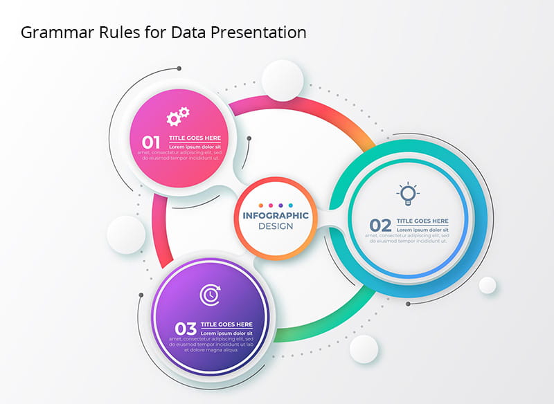
Components of Data Visualization
Effective data presentation involves following certain rules to ensure clarity and accuracy in your visualizations.
Proper Labeling
Always label your visualizations properly. This includes labeling axes, data points, and any other essential elements. Labels provide context and help viewers understand what they're looking at. Ambiguity in labeling can lead to misinterpretation.
Scaling and Axes
The choice of scale and the clarity of axes are critical. Ensure that your scales are appropriate for the data you're presenting. Misleading scales can distort the viewer's perception of the data. Clearly mark your axes to provide context and units of measurement.
Use of Legends
Legends are essential when you use complex visualizations. They clarify what each element or color represents in your visualization. Without a legend, viewers may struggle to understand the meaning behind the visual elements. With a solid understanding of visual grammar and presentation rules, you'll be better equipped to create visualizations that communicate your message effectively.
Storytelling Through Data Visualization
Creating a Narrative
Data visualization isn't just about displaying numbers; it's about telling a story with data. Here's how you can create a narrative through your visualizations:
Setting the Context
Begin your visualization with a clear context or question you aim to answer. What's the problem or insight you want to convey? Providing context helps viewers understand the relevance of the data.
Building a Flow
Arrange your data elements in a logical sequence that guides viewers through your story. Start with the basics and gradually introduce more complex information. Think of it as a journey where each visualization builds upon the previous one.
Engaging Your Audience
Engaging your audience is crucial to making your data memorable and impactful.
Incorporating Anecdotes
Personal anecdotes or real-world examples can make data relatable. Sharing stories that connect with the data can captivate your audience and make the information more meaningful.
Using Visual Metaphors
Visual metaphors simplify complex concepts. For instance, using a traffic light to represent performance-green for good, red for bad-can make data instantly understandable. Metaphors tap into our innate understanding of symbols and associations.
By creating a narrative and engaging your audience through anecdotes and metaphors, you can turn data into a compelling story that resonates with your customers.

Data Visualization Best Practices
Data Sources and Cleaning
Before diving into visualization, ensure your data sources are reliable and clean. Garbage in, garbage out. Pay attention to data quality, and be prepared to clean, preprocess, and validate your data as needed. A strong foundation is essential for meaningful visualizations.
Choosing the Right Visualization Type
Selecting the appropriate visualization type is crucial. Don't force your data into an unsuitable format. Consider the nature of your data and the message you want to convey. Whether it's a bar chart, line graph, or a more complex visualization, choose the one that best tells your story.
Interactivity and User Engagement
Consider adding interactivity to your visualizations. Interactive elements allow users to explore the data themselves, increasing engagement and enabling deeper insights. Interactive charts, filters, and tooltips can provide a richer experience for your audience.
Common Data Visualization Mistakes and Data Validation
Even with the best intentions, mistakes can happen in data visualization. Being aware of common pitfalls is essential for creating effective visuals.
Overcrowding and Clutter
Avoid overcrowding your visualizations with too much information. Simplicity often leads to greater impact. When a chart or graph becomes cluttered, it can confuse rather than clarify. Keep it clean and focused on the main message.
Ignoring Data Integrity
Data integrity is paramount. Before visualizing your data, check for outliers, missing values, and inconsistencies. Flawed data can lead to incorrect conclusions and undermine the credibility of your visualizations.
Misrepresentation of Data
Never manipulate data to fit a narrative. Always present data honestly and accurately. Misrepresenting data not only damages trust but can also have serious consequences.

Conclusion
Looking at the grammar of data visualization can help businesses have better decision-making use insights for enhanced business and customer experience. However, to ensure that businesses get optimum results through data visualization, it is essential for organizations to understand best practices and avoid common mistakes.
As we discuss tools and best practices of data visualization in this article. The final chapter in this series, we will look at future of data visualization and some common tips on collaborating data in teams so stay tuned and keep on reading.